Eye Candy | Wijnegem (BE)
Bart van Beever always wants something special.
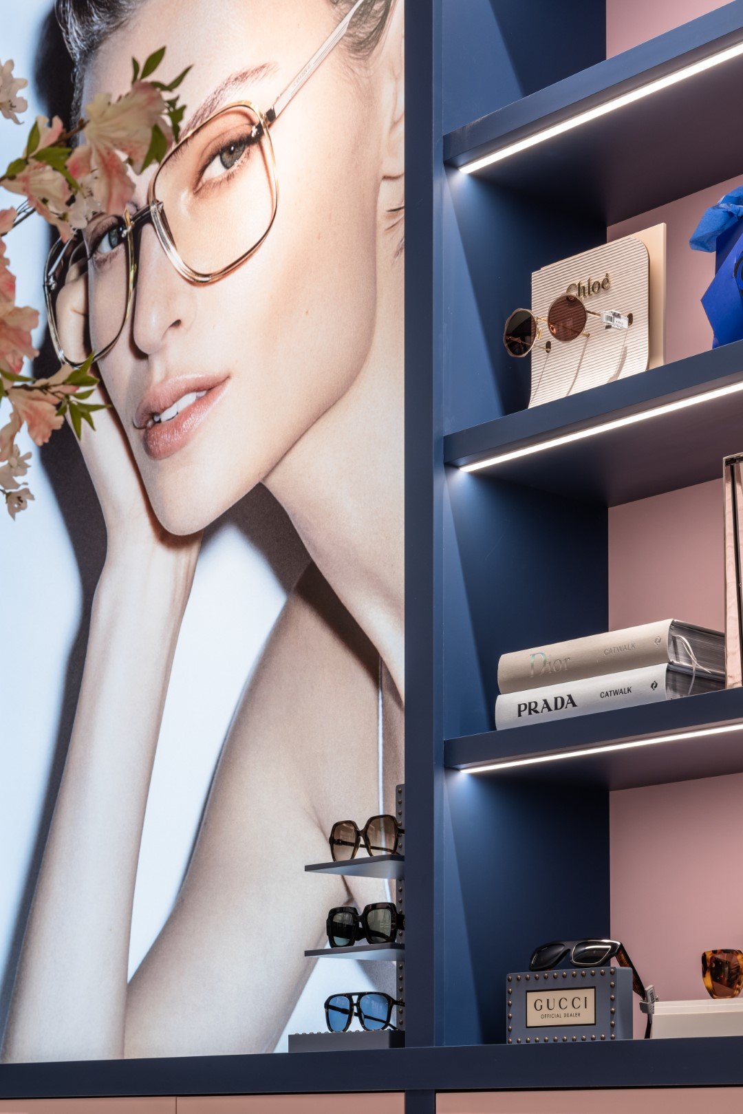
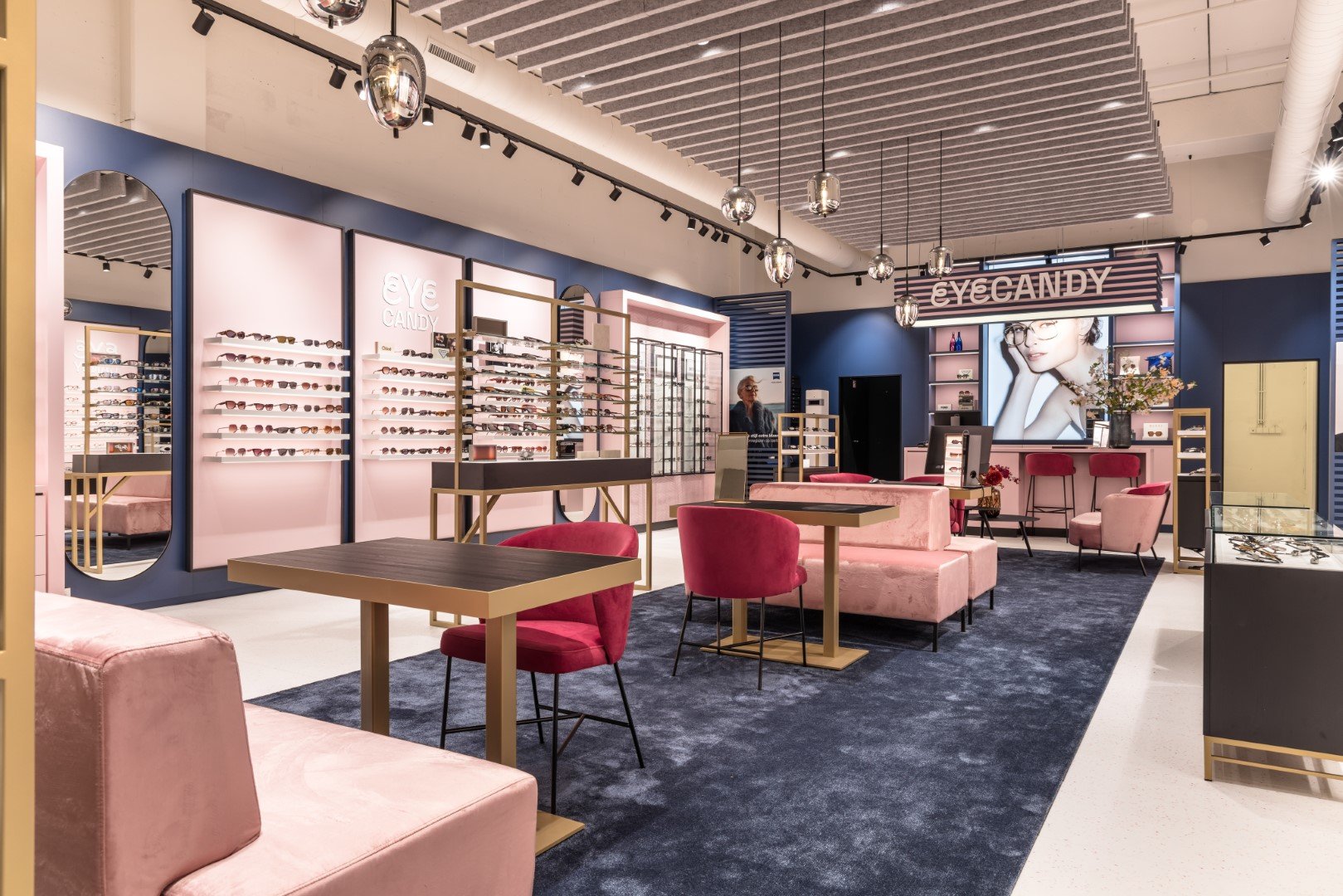
The presentation is illuminated both from the shelves and from the ceiling. This gives the collection a beautiful and commercial stage. Is the acetate of the glasses dark blue or black? In the previous store, it was barely discernible, but now the difference is very precise. A well-designed lighting plan makes this possible. In terms of layout, the choice was made to place the sales and waiting areas in the center and the sales along the walls. This allows you to wander along the walls undisturbed while also sitting comfortably as a customer. The customer reactions are great, so we can say that the goal has been achieved!
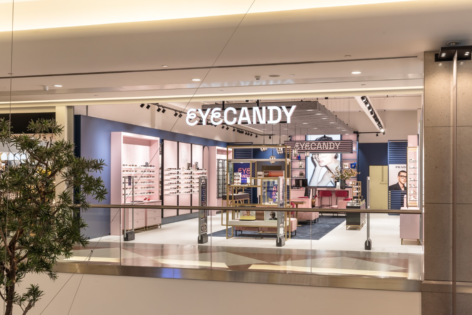
Eye-catching shop fittings
This time, it was allowed to be completely different. The message from our client was clear: a store that truly stands out from all the other stores (and there are many in Shopping Wijnegem). Additionally, it needs to showcase the collection. Bold colors and materials make the store really pop. White, blue, and pink are the base colors around which everything is built. It was a challenge to keep everything balanced so that the store remains accessible to a wide audience.


Applied products
Customized with material selection from the webshop


Recent projects
Personal advice
We help you find the perfect store interior that meets your needs and budget.
")


")
Forbettershops.com offers you the opportunity to design and shop a modular and budget-friendly store interior. These furniture pieces make it very easy to make adjustments without major structural changes.